 A few years ago I had the pleasure of meeting Sam Peffer at one of the annual UK Vintage Paperback and Pulp Fairs held in a hotel in London’s Victoria. Peffer, who signed his work Peff, was one of the UK’s foremost paperback cover illustrators of the 50s and 60s. Later on he’d turn to film poster and video sleeve design but it’s his hyper-realist, melodramatic cover paintings, many of them for Pan Books, that define an era and appeal to modern collectors in this relatively low-cost hobby. It was Peff’s cover art that graced the early paperback runs of Ian Fleming’s novels, before the ad-land minimalism of Raymond Hawkey took their design onward into another era. Between 1956 and ’68 he produced 168 covers for Pan alone.
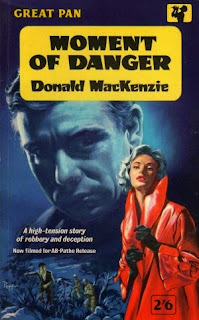
(This is one that I picked up just a few weeks ago, by a writer who deserves to be better-remembered. Mackenzie was a former criminal who wrote character-driven thrillers. The more of his stuff I read, the more I tend to think of him as a British Charles Williams.)
Sam Peffer died in 2014, at the age of 92. You rarely see his original work on sale and when it does hit the market, I imagine it’s at one of those pulp art sales by one of the major auction houses where bidders are international and prices climb through the roof.
Let me say right out, I’m not one of those high-roller collectors. Not even a collector, as such. I’ve just got a few pieces and posters, all of them with some personal meaning, all picked up at bargain prices. A Jim Mooney Spider Man page that I found in a Manchester comic book shop in the 70s, and for which I paid seven quid. Ron Embleton’s cover art for the first Robin Hood annual I owned, spotted on eBay. An American circus poster that I stole from a notice board in Wyoming, the day after the circus left town.
 When I saw this piece in the listings of The Illustration Art Gallery for around the price of a modest bookcase (just to keep it in perspective), I dithered a bit and then I fell. I thought I recognised it from the Mackenzie book, then realised I didn’t.
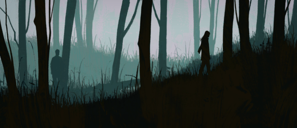
It’s a completely-finished gouache, not a rough. And while concept and composition closely resemble those of the Moment of Danger cover, the individual details differ. The large portrait head is more ‘finished’ on the cover; the foreground woman more detailed and accomplished in the artwork. Different model, different pose. A moorland chase in one, a gothic mansion in the other.
The gouache isn’t signed, and my guess is that it’s either a demonstration piece or an unpublished or rejected commission that Peffer did over for a different job. Having recycled such a close take on the idea, he couldn’t use the actual painting again.
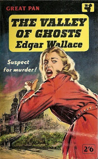
 But take a look at this cover, for Edgar Wallace’s The Valley of Ghosts. Peff worked from photographic reference, sometimes using models, often family members or even himself to get poses and lighting right. In this one he clearly used another shot from that original studio session – same model, same coat, same belt, and a variation on the pose. That creepy house in the background is looking familiar, too.
The look is more commercial, the level of finish not so high. The art director who rejected the original in my imagined scenario was probably right. The woman in the painting is a palpably real person in a way that the women on the published covers aren’t… they’re visibly fictional, one a femme fatale, the other a fleeing victim.
It’s a context where too much honesty would jar. So for more than fifty years the painting has languished… somewhere, I don’t know where.
But Peff, wherever you are, let me assure you… it’s being appreciated now.


One response to “Peff”
Thank you for this. I'm just re-editing a book on Peter Cheyney hopefully to be published in May. I have a chapter on Cheyney's book covers, some of which came from Peff, and I found your post very useful